Monday, December 3, 2012

Howdy

Gosh, it's been months since I've posted.  I'm not posting with anything interesting, other than a brief explanation that life has taken me in other directions. 

Look through my polyvore, pinterest, or find me in my facebook group or page.

Sunday, September 16, 2012

Sewing

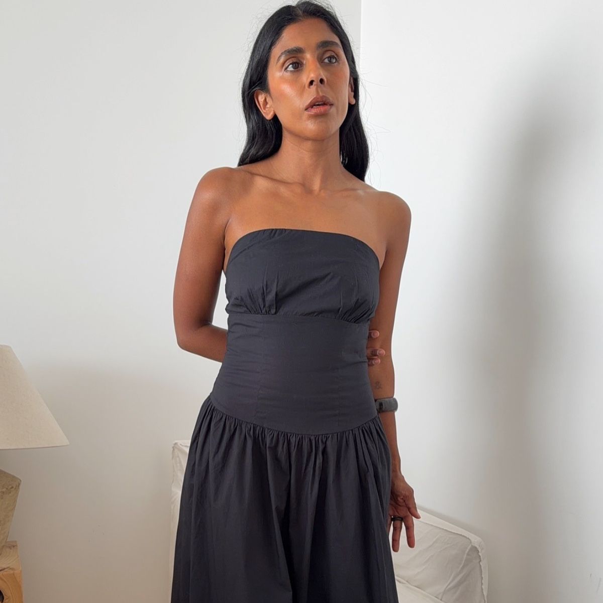
DARK DENIM MOTO JACKET


I chose very dark blue denim so that it reads almost black, but unlike black denim would avoid the problem of how hard it is to match blacks.  Also it could conceivably go with navy or grey of T2/4.

BEFORE
AFTER

reconstructed clothing


Follow by email (see top right)
Send me an email: janerekas@hotmail.com Jane Rekas, LCSW

Thursday, September 13, 2012

Color Me Confident

"Hi gang. Check out this link (below) for some great ideas from a book called "Color Me Confident". I noted many colors can overlap into palettes making it confusing, or be close to your palette so they will look ok on you but not your best. By sticking to the "palette" first and then looking at the additional colors listed made it less confusing for me. For example, being a Bright Spring=clear+warm+ light (in that order), so I can wear all clear, then the additional warm/light colors listed. These same additional colors are also listed for Light Spring (that's why I thought I was light spring) but not all of the colors in the Light Spring Palette look my best, ruling it out as my season. Also, if I look at the warm and light as primary palettes, I can't wear all of the colors listed. In the clear palette, I noted the neutral colors that overlapped into the palettes: cool, warm, light and deep because Bright Spring is a neutral season. It helped me to make a list (my secondary T2 lol) and compare." 

Sabina Ubu http://sabinas-ubu.blogspot.com/
Color Me Confident: Change Your Look - Change Your Life!
Color Me Confident: Change Your Look - Chan...
by Veronique Henderson
$12.23
2008 This book combines beautiful pictures of color types, with style personalities. http://www.colourmebeautiful.co.uk


Follow by email (see top right)
Send me an email: janerekas@hotmail.com Jane Rekas, LCSW

Friday, September 7, 2012


playing on the T2 / T4 dichotomy of rules and challenges, it could be fun to explore all the rules and try them out playfully and also remember they are all voluntary, meant to enhance your well being and self expression, and our selves are so extraordinarily complex, that simply harmonizing with our coloring might not be the be-all-end-all, anymore than harmonizing with our personality "type," but trying out different looks, like chords in songs


Follow by email (see top right)
Send me an email: janerekas@hotmail.com Jane Rekas, LCSW

Tuesday, September 4, 2012

Monday, September 3, 2012


My soul Is My Guide.~ Rumi


Follow by email (see top right)
Send me an email: janerekas@hotmail.com Jane Rekas, LCSW

Type 4 Cats!

 
My 8 yo cat is a tuxedo named Coco.  We recently got her a companion, little Luna, another tuxedo.


Follow by email (see top right)
Send me an email: janerekas@hotmail.com Jane Rekas, LCSW

How systems differ? Entrance

All of these systems differ slightly as to how you access them:
are they fully online, are they in print, are they in person consultation?
are they minimal cost? close to free? moderate cost? spendy?
are you the expert or does the system have a guru? or are their many trained consultants?


Follow by email (see top right)
Send me an email: janerekas@hotmail.com Jane Rekas, LCSW

Monday, August 20, 2012

Adding in your secondary

Assuming that one way to handle your secondary, is to make it secondary to your palette.  In other words, keep your palette colors (DYT, IE, Wright, Kitchener, etc.), but then add in some of the other aspects: design lines, fabrication, texture or pattern of your secondary.

Here are the three types with secondary 1, differing in their base palette.


Here are the three types with secondary 2, differing in their base palette.
Here are the three types with secondary 3, differing in their base palette.


Here are the three types with secondary 4, differing in their base palette.


Follow by email (see top right)
Send me an email: janerekas@hotmail.com Jane Rekas, LCSW

Sunday, August 19, 2012

How some of the systems differ: body shape


The Truth About Your Body Shape - Dressing Your Truth Beauty Tip

Carol and Anne make the point that dressing to your body shape is secondary to the 5 elements of DYT: color, design lines, fabrication, texture and pattern.  So if you dress in those elements for your type, your body shape is less problematic.  One thing to highlight is what design lines mean: essentially the shapes of your clothing should support your movement.

The Science of Personal Dress

Irenee Riter's system is based so much on body shape that the types are referred to by their core shape.


Follow by email (see top right)
Send me an email: janerekas@hotmail.com Jane Rekas, LCSW

Personal Style Counselors: John Kitchener

Videos

Women
LIVELY/BRIGHT

SUBTLE/BLENDED

EARTHY/RICH

STRIKING/CONTRAST
Men
LIVELY/BRIGHT

SUBTLE/BLENDED

EARTHY/RICH
STRIKING/CONTRAST

Follow by email (see top right)
Send me an email: janerekas@hotmail.com Jane Rekas, LCSW

Saturday, August 18, 2012

Types and Tones

Before DYT there was:
CAYGILLKITCHENERWRIGHTSINCLAIRESEGERSTROM
Suzanne Caygill 1942, book 1980 
Joan Songer & John Kitchener, Personal Style Counselors, 1964
Jane Segerstrom 1980 & 1988
Angela Wright, Color Psychology 1985
Taylore B. Sinclaire IlluminEssensce ~1992
see Types and Tones

Jane Segerstrom
There is another out of print set of books that also has a four type system:
Jane Segerstrom's Look Like Yourself and Lo...  c) 1980
Style Strategy: Winning the Appearance Game  c) 1988


"Personality is a useful tool for indicating one's Type, but appearance is equally effective .  If the two were in opposition we'd have a dilemma, but they aren't.  Recent independent research by Frances Quinn, Suzanne Caygill, Joan Songer and Don Cardwell in the San Francisco Bay area has proven one's coloring, bone structure and personality mutually reinforcing.  You're made right." p. 23 Look Like Yourself and Love It.

Suzanne Caygill, Color: The Essence of You 
Joan Songer, originator of Personal Style Counselors http://www.pscjohnkitchener.com/an_index.html 


She cites Tim LaHaye's work on termperments
correlates them with the types.

T-1 Sanguine, T-2 Melancholy, T-3 Choleric, T-4 Phlegmatic
*Note she reverses T-2 and T-4


She actually has a personalized method of choosing your unique colors, but then also gives these guidelines:


T-1 colors are: clear, clean bright
cool grays, clear grays, blacks, creams, beiges, coffees, medium browns, dark browns, navy blues, lemons, limes, kellys, turquoises, aquas, blueberries, raspberry sherberts, grapes, violets, lilacs, lavenders, roses, strawberries, tomatoes, melons, salmons, peaches, orange sherberts, and tangerines.

"wear crisp, smooth fabrics... small scale, round shape detailing on necklines, collars, lapels, buttons, buckles, and jewelry..."

jewelry: "highly polished round earrings, bright and amusing, smooth round beads, creamy pearls, thin gold or silver chains, airy rings of gold loops or flowers or butterflies, heart-shaped silver pin or key chain ornament...."


T-2 colors are: soft, grayed, blended
creamy off-whites, grayed beiges, grayed and pinkish browns, clear and blued grays, blacks, dull navys, soft yellows, soft greens, grayed greens, grayed blue-greens, gentle blues, soft purples, lavenders, mauves, delicate blue-reds, soft reds, roses, pinks and peachtones.

"wears variations of one color head to toe, keeping contrast to a minimum... soft luxurious fabrics... jewelry choices are highly refined; ...pearl... brushed silver ovals..."

jewelry: "exquisite ... look of age... fanciful engraving... glowing cameos, filigreed lavalier, oval locket on narrow velvet ribbon... clusters of stones instead of solitaires, esp. opals, amethysts, garnets, cabochon emeralds, smooth pink coral, pearls, diamonds and other glowing iridescent jewelry."


T-3 colors are: warm, rich, earthy
warm grays, blacks, all the browns, coppers, rusts, brownish reds, reddish purples, burgundies, purples, teals, olives, avacados, acid greens, sages, celerys, golds, golden yellows, and pumpkins

"gauzy or handwoven shirts in earthtones... lapels are sharp and the pocket detailing - angular... buttons are no longer classic; now they're rough-textured metal, bone or woven leather..."

jewelry: "all the metals-copper, nickel, brass, bronze, gold, silver, platinum-worked in unusual, asymmetric designs.  Choose antique, hammered, encrusted effects.  Lion's head, temple dragon or serpent designs, heavy squash-blossom necklace, celtic cross, carved ivory... (etc) ... multiple chains."


T-4 colors are: brilliant, contrasting, clear
all the whites, all the blacks, clear grays, bluish grays, brilliant yellows, shocking oranges, scarlets, fuschias, cerises, red-purples, royal purples, bright royal blues, peacock blues, bright aquas, emerald greens, silver and cool bright pastels.

"best look is a beautiful one, totally understated, no frills, trims, or applied design... clothing with the simplest of lines... but nothing drab....

jewelry: "limit to only ONE important piece for any outfit...Look for strong, clean shapes.  Wear a finely-crafted, highly polished silver arm-bracelet... earrings include half-moons, buttons or drops which do not swing or make a sound... shiny oval pendants... matched strands of pearls/jet beads/crystal beads, silver chains and settings of onyx, sapphine, star sapphire, ruby, emerald or diamond."


Note: she only gives whites to T-4 but give blacks to all the types but T-2s!

Follow by email (see top right)
Send me an email: janerekas@hotmail.com Jane Rekas, LCSW

DYT Secondary?


"FAQsDo I need to know my secondary Type before buying my Dressing Your Truth Course?
Most women do not know their secondary Type before buying their Dressing Your Truth course for their Beauty Type. Once you begin to dress and live in your dominant Beauty Type, your secondary Type will start to reveal itself. You do not need to own courses for both Types."

How and Why to LOVE Your Secondary Energy Type

youtube video text
Even though you're all 4 Types in my Energy Profiling System, you lead with a dominant expression....And your secondary Type can come in a close, well, second... You identify your secondary Energy Type the same way you identify your dominant Energy Type—intuitively. 

We are meant to live consistently in our dominant Energy Type. Our secondary is just meant to be a support. Unfortunately, many adults were wounded as children and overdeveloped their secondary Energy Types because they felt safer that way.


Should I buy another course for my secondary Energy Type?

"NO! You should always dress in your primary Energy Type. If you start to mix you will become more confused and will not create the movement you want to bring out your best look. You will naturally be drawn to how to bring in secondary features..."


Follow by email (see top right)
Send me an email: janerekas@hotmail.com Jane Rekas, LCSW

FOUR OR TWELVE?


A criticism of systems like DYT, Color Psych and IE that you will hear is that they are two simplistic and limited with only 4 types or tones.  This criticism of the original four seasons of Color Me Beautiful, etc., led to the 12 Seasonal categories we have today (and sometimes even 16 categories).


There are arguments on both sides of the simplicity question. I definitely think that it's hard for people to focus on just one aspect of their personality to the exclusion of others. But (even though I'm a DYT critic) I can see why forcing the expression of your "dominant" in one of the four categories expresses an archetype that they each represent.  These 4 category systems emphasize color, design lines, fabrication, texture and pattern, but the way they use color is not correlated to your personal coloring as much as an expression of your energy movement.

Type 1= yang, then yin, Type 2=all yin, Type 3=all yang, Type 4=yin, then yang

 When you dilute the archetype with your secondary energies, you do just that dilute the message. DYT (and IlluminEssensce and Color Psychology) are based on the idea that you are expressing something primal.  I've come down on both sides of the argument at different points in my journey.


If Spring correlates to Type 1/Tone I, it is mostly yang, with some yin, and light upward movement.
DYT associates air with T1, while Wright associates water with it, but they both have the same shape, circle.

"These colours are delicate, warm and clear, containing very little 
black – ideally, none. They are often tints."*

So comparing these guidelines for the 1/I category to the three Spring season breakouts, what happens is you are bringing in your secondary but in terms of colors, such as a clear spring wearing the black of a winter.  That is where the systems would diverge, because then you are losing the light upward movement of lighter colors.


If Summer correlates to Type 2/Tone II, it is all yin with a downward movement, yet fairly still.
DYT associates water with T2, while Wright uses air for this season, but they both have the same shapes 
(s curve and tear drop).

"These tones are also delicate, but they are subtle and cool, most of 
them containing grey.  The hues have a percentage of blue added and 
chromatic values are relatively low. They can be dark, but are never heavy."*


So comparing these guidelines for the 2/II category to the three Summer season breakouts, what happens again is you are bringing in your secondary but in terms of colors, but in the case of this season, it's not too far reaching from the guidelines.


If Autumn correlates to Type 3/Tone III, it is all yang with an active, creative movement, like fire.

"These colours are again warm, but more intense and more subtle 
than Group 1, sometimes with very high chromatic values and usually the 
addition of some black. The hues have yellow or red  added  to  them."

Wright uses a square for the masculine energy of Autumn Type 3, while DYT uses triangles 
and geometric shapes.
Riter also uses square for the masculinity of this season.
Kitchener uses rectangle, square and triangle.

So comparing these guidelines for the 3/III category to the three Autumn season breakouts, what happens is you are bringing in your secondary but in terms of colors, such as a deep autumn wearing the black of a winter.  That is where the systems would diverge, because then you are losing the energetic movement of warmer colors.


If Winter correlates to Type 4/Tone IV, it is yin, with some yang, and very still (no movement), like earth.
Wright uses a triangle shape for Type 3, while DYT uses elongated rectangles and ovals.

"The essence of this colour group is contrast and strength. The hues 
have blue added and either white or black, although they can be pure hues... 
Pure black and white themselves belong in this colour group."

So comparing these guidelines for the 4/IV category to the three Winter season breakouts, what happens is you are bringing in your secondary but in terms of colors, such as a deep winter wearing the sepia of an autumn.  (Also, gray which is a neutral in the 3 Winter seasons, would not be included in the DYT, IE or Color Psych winter/4).  That is where the systems would diverge, because then you are losing the still movement of clear hues.


Colour Affects 908 Keyes House, Dolphin Square, London SW1V 3NB 

"With regard to colour preference, this theory puts  forward the idea that 
humanity too can be divided into four psychological groups that correspond 
to the four colour groups. People in these groups share certain psychological 
and physical characteristics. Possibly because of these shared psychological 
characteristics, they also share aesthetic responses to colour."


Follow by email (see top right)
Send me an email: janerekas@hotmail.com Jane Rekas, LCSW